Hello Readers,

Welcome back to my blog. Today we will discuss analysis of a term document matrix that we created in the last post of the Text Mining Series.
We will perform frequent term searches, and terms associations with visualizations. Then we finish the post by creating a visual word cloud (to the right) to 'display' the content of the terms in the tweets from @nbastats. Read Part 5 here.
Start R and let us begin programming!
Here we continue from where we left off last time. Begin by loading the twitteR, tm, and ggplot2 packages in R. Using the findFreqTerms() function in the tm library to find the most frequent terms. We can specify the lower and upper bounds of the frequency values using lowfreq and highfreq. Here we return terms with 20 or more occurrences.
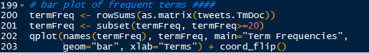
Next we take the 17 terms and create a bar graph of the frequencies using ggplot2. We can obtain the term counts by using rowSums() and we subset the sums to return values 20 or greater. Then we can plot the graph using qplot(), and the geom="bar" argument will create the bar graph, the coord_flip() flips the x and y axis.
The neat result is shown below:
We can see that "games", "last", and "amp" are the top three terms by frequency.
Using word associations, we can find the correlation between certain terms and how they appear in tweets (documents). We can perform word associations with the findAssocs() function. Let us find the word associations for "ppg" (points per game) and return the word terms with correlations higher than 0.25.
We see that "ppg" has a high 0.65 correlation with "rpg", or rebounds per game. This makes sense as a tweet which contacts statistics about the points per game would also include other statistics like rebounds as well as "apg"- assists per game and "fg" field goals.
What about a team, say the Heat which has LeBron James? We can find the word associations for "heat":
The top correlated terms are "adjusts", "fts" (free throws), "rockets", "thunder", and "value". Both the Houston Rockets and the Oklahoma City Thunder at top teams so it makes sense that there would be mentions of top teams in the same tweet, especially if they play against each other. LeBron is having a record year in player efficiency which might be why "trueshooting" is an associated term with 0.49 correlation for true shooting percentage.
We can plot the word associations for "heat". The code, similar to the previous plot, is shown below.
Which yields:
And there we have the word associations for the term "heat". I think that is a nice looking visual.
We are going to continue the visual creation spree, and this time we will create a word cloud. Load the wordcloud package in R and convert the tweet term document into a regular matrix.
After we created a word count of all the terms and sorted them in descending order, we can proceed to making the word cloud. We will set a set seed (at 1234) so that the work is reproducible. We need to create a gradient of colors (this time in gray) ranging from 0 to 1 for the cloud, based on the frequency of the word. More frequent terms will have darker font in the word cloud.
With the wordcloud() function, we can create the word cloud. We need to specify the words, their frequencies, a minimum frequency of a term for inclusion, and the color of the words in the cloud.
Welcome back to my blog. Today we will discuss analysis of a term document matrix that we created in the last post of the Text Mining Series.
We will perform frequent term searches, and terms associations with visualizations. Then we finish the post by creating a visual word cloud (to the right) to 'display' the content of the terms in the tweets from @nbastats. Read Part 5 here.
Start R and let us begin programming!
Plotting Word Frequencies
Here we continue from where we left off last time. Begin by loading the twitteR, tm, and ggplot2 packages in R. Using the findFreqTerms() function in the tm library to find the most frequent terms. We can specify the lower and upper bounds of the frequency values using lowfreq and highfreq. Here we return terms with 20 or more occurrences.
 |
| High Frequency Terms |
Next we take the 17 terms and create a bar graph of the frequencies using ggplot2. We can obtain the term counts by using rowSums() and we subset the sums to return values 20 or greater. Then we can plot the graph using qplot(), and the geom="bar" argument will create the bar graph, the coord_flip() flips the x and y axis.
 |
| Bar Graph Code |
The neat result is shown below:
 |
| Term Frequencies |
We can see that "games", "last", and "amp" are the top three terms by frequency.
Finding Word Associations
Using word associations, we can find the correlation between certain terms and how they appear in tweets (documents). We can perform word associations with the findAssocs() function. Let us find the word associations for "ppg" (points per game) and return the word terms with correlations higher than 0.25.
 |
| Associated Terms for "ppg" |
We see that "ppg" has a high 0.65 correlation with "rpg", or rebounds per game. This makes sense as a tweet which contacts statistics about the points per game would also include other statistics like rebounds as well as "apg"- assists per game and "fg" field goals.
What about a team, say the Heat which has LeBron James? We can find the word associations for "heat":
| Word Associations for "heat" |
The top correlated terms are "adjusts", "fts" (free throws), "rockets", "thunder", and "value". Both the Houston Rockets and the Oklahoma City Thunder at top teams so it makes sense that there would be mentions of top teams in the same tweet, especially if they play against each other. LeBron is having a record year in player efficiency which might be why "trueshooting" is an associated term with 0.49 correlation for true shooting percentage.
We can plot the word associations for "heat". The code, similar to the previous plot, is shown below.
 |
| Plotting "heat" Word Associations |
Which yields:
 |
| "heat" Word Associations |
And there we have the word associations for the term "heat". I think that is a nice looking visual.
Creating a Word Cloud
We are going to continue the visual creation spree, and this time we will create a word cloud. Load the wordcloud package in R and convert the tweet term document into a regular matrix.
 |
| wordcloud, Matrix Conversion, and Sorted Word Frequencies |
After we created a word count of all the terms and sorted them in descending order, we can proceed to making the word cloud. We will set a set seed (at 1234) so that the work is reproducible. We need to create a gradient of colors (this time in gray) ranging from 0 to 1 for the cloud, based on the frequency of the word. More frequent terms will have darker font in the word cloud.
With the wordcloud() function, we can create the word cloud. We need to specify the words, their frequencies, a minimum frequency of a term for inclusion, and the color of the words in the cloud.